
Brand & downloads
One clear identity. A shared pause.
Our globe represents people practicing across places and timezones. Use these original assets when referring to Global Meditation Live, with space to breathe and a clear connection to this project.
Download the brand guide
PDF guide · Logo usage, color, typography, and voice
01 / The identity
A world of shared practice.





Leave at least one quarter of the globe’s diameter clear on all sides. Keep the standalone mark at least 24px tall and the full logo at least 180px wide. Do not stretch, recolor, or imply an organizer partnership.
02 / The palette
Quiet color. Clear contrast.
Ink#152D33
Warm paper#F6F5EE
Lime#DFEAAA
Teal#2E665D
Muted#5C696A
White#FFFEF9
Line#D9DED4
Use ink for text on warm paper, or warm paper on ink. Lime is an accent and button background with ink text. Reserve the softer line color for separators, not text.
03 / Typography & voice
Room to pause.
Clarity to begin.
Georgia for the invitation.
Regular serif headings bring warmth. Italic emphasis is used sparingly. The fallback is Times New Roman, then a system serif.
Arial for the practical details.
Times, costs, joining instructions, and navigation use Arial, with Helvetica and system sans-serif fallbacks. Our voice is welcoming, precise, and grounded in official sources.
We avoid unsupported health claims, invented attendance, and claims that meditation changes a global energy field.
04 / Sharing the project
Made to travel together.
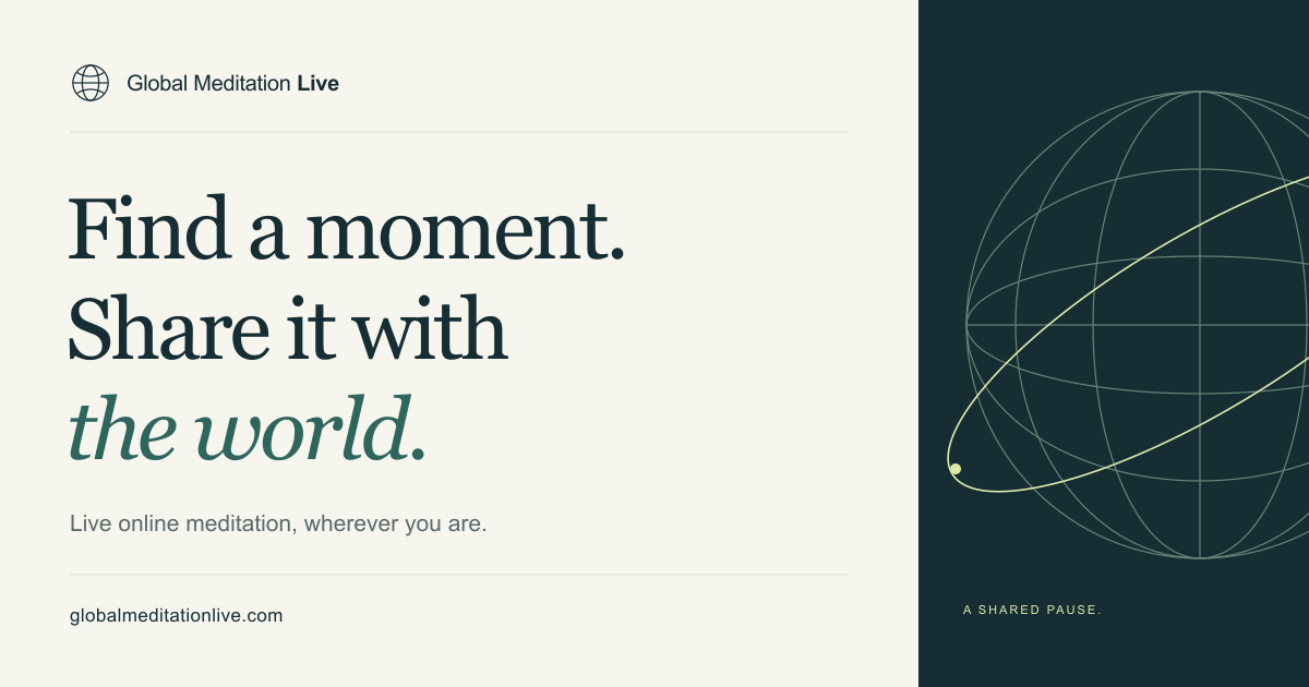
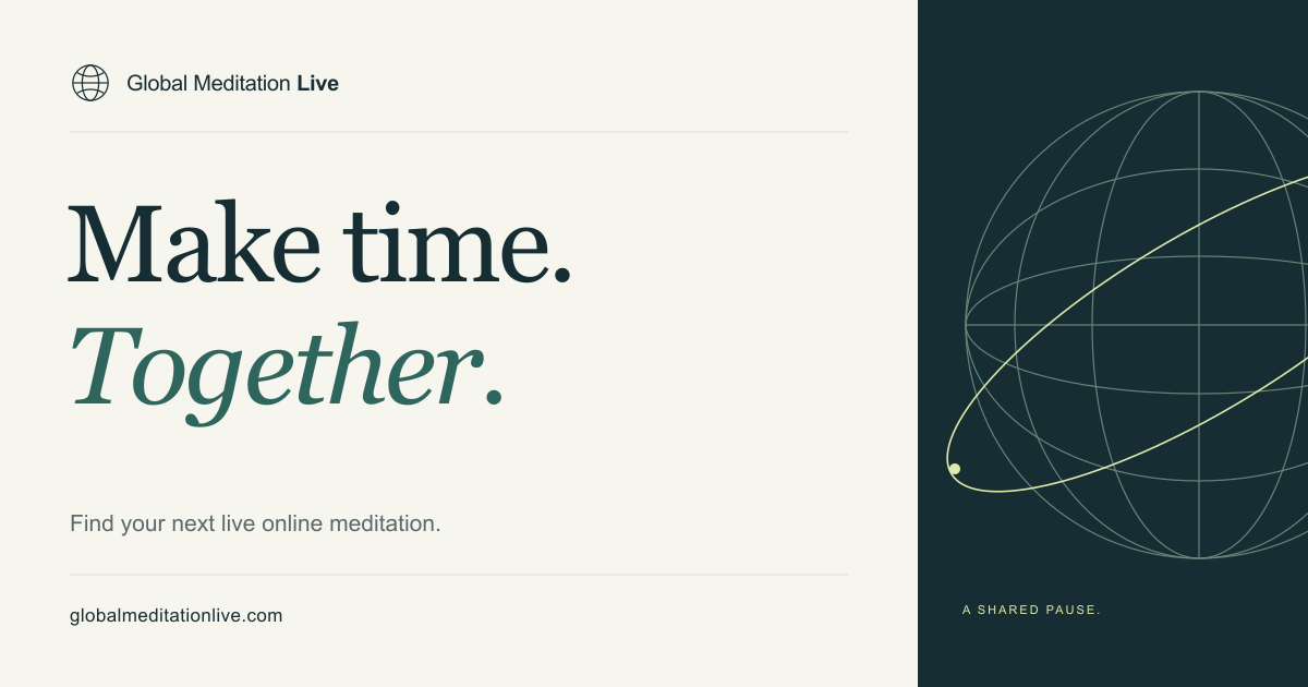
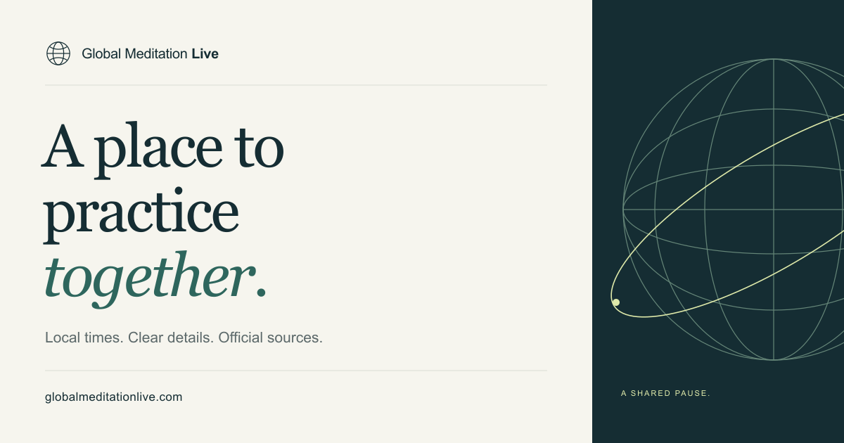
1200 × 630 PNG. Keep text at least 64px from the image edge. The globe illustration may bleed off the right edge; the logo and words should remain intact.